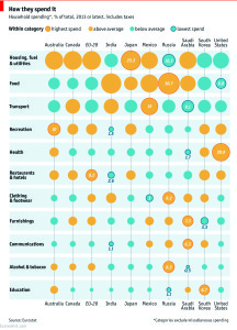
 Doug and Tammie discuss how some countries are spending their money and where the US compares as a whole.
Though the chart, created by the Data Team with The Economist, may be lacking in how countries are taxed or not taxed it is an interesting glimpse into the wallet of a few of the countries spending habits. Some of the differences are accounted for by pure economics of a country. However, in the end US Healthcare costs are taking up the biggest portion of our American dollars.
Click on the chart link below or follow the link above to take a closer look:
Podcast: Play in new window | Download
